I participated developing a board game as illustrator and designer (the project is currently under development)
For this board game I drew a series of game carts. Designing the carts I was thinking about players user experience. I set myself the task not just involve people in fantastic story but make it ease for them to understand the rules and carts types. So I created illustrations in order to make them easy to identity and classified for players.
Special attention was paid for backside of the carts. I intended to create a monolithic pattern composed when carts are placed side by side on the play desk. The color scheme is shaded in order to create a background making opened carts more visible.


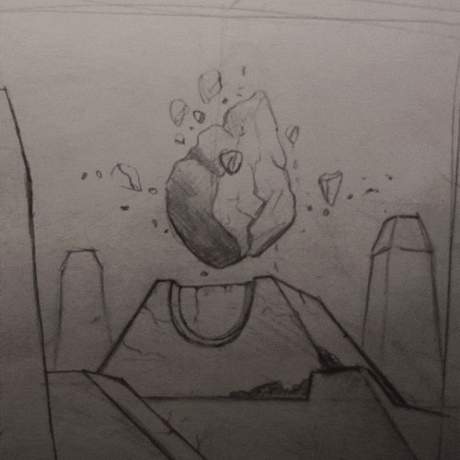
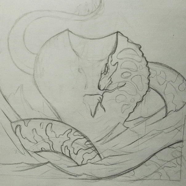
By the game concept there is four elements (fire, water, air and earth) which determine carts. So I created illustrations using common features to each of elements in order to make them easy to identity and classified for players.
So for example looking on the car of "Fire" and "Air" type, you can notes them are very dynamic. Conversely, there "Earth" carts convey static. There Earth elements are grounded and monumental. "Water" cart are slightly dynamic but composition is symmetrical and elements are moving to the central of composition reflecting the water quality, stiving to balance.


Making-off